8 CSS Animation Examples You Can Copy and Use
Eight ready-to-use CSS animations with the code explained, the difference between transitions and keyframes, and how to keep motion smooth and accessible.
CSS has two ways to animate. A transition smoothly changes a property when a state changes, such as on hover. An animation with @keyframes runs a sequence on its own and can repeat. Below are eight copy-and-paste examples: fade in, slide up, pulse, loading spinner, typing text, hover lift, shake and a moving gradient.
A little movement makes a page feel finished. A button that lifts when you point at it, content that fades in, or a spinner while something loads all tell the visitor that the page is responding. You do not need JavaScript or a library for any of it. A few lines of CSS are enough.
This guide starts with the difference between transitions and keyframe animations, then gives you eight examples you can copy straight into a project. Each one is explained, so you can change it with confidence. To try them, paste the HTML and the base CSS below into the HixCode online code editor, then add any example underneath.
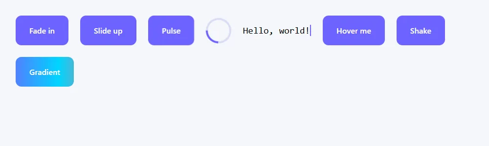
The HTML and base CSS for every example
<div class="demo">
  <div class="box fade-in">Fade in</div>
  <div class="box slide-up">Slide up</div>
  <div class="box pulse">Pulse</div>
  <div class="spinner" role="status" aria-label="Loading"></div>
  <p class="typing">Hello, world!</p>
  <div class="box lift">Hover me</div>
  <div class="box shake">Shake</div>
  <div class="box gradient">Gradient</div>
</div>body {
font-family: system-ui, -apple-system, "Segoe UI", Roboto, sans-serif;
background: #f5f7fb;
padding: 24px;
}
.demo {
display: flex;
flex-wrap: wrap;
gap: 24px;
align-items: center;
}
.box {
padding: 20px 28px;
background: #6c63ff;
color: #fff;
font-weight: 600;
border-radius: 12px;
}Transition or animation: which one?
A transition needs a trigger. You describe the start and the end, and the browser fills in the steps between them whenever the property changes:
.button {
  background: #6c63ff;
  transition: background 0.2s ease, transform 0.2s ease;
}

.button:hover {
  background: #574fd6;
  transform: translateY(-2px);
}
The transition line goes on the element’s normal state, not on :hover. That way the change is smooth in both directions, when the pointer arrives and when it leaves.
An animation needs no trigger. You define named steps with @keyframes, then attach them to an element with the animation property. It can start by itself when the page loads, have as many steps as you like, and loop.
| transition | animation + @keyframes | |
|---|---|---|
| Starts when | A property changes (hover, focus, a class added) | Automatically, or when a class is added |
| Steps | Two: start and end | Any number |
| Can loop | No | Yes |
| Best for | Hover and focus effects, menus opening | Entrances, loaders, attention effects |
1. Fade in
.fade-in {
  animation: fadeIn 0.8s ease-out both;
}

@keyframes fadeIn {
  from { opacity: 0; }
  to   { opacity: 1; }
}
The simplest entrance. from and to are the first and last frames. The word both at the end is the fill mode: it keeps the element invisible before the animation starts and keeps the final frame afterwards, which matters most when you add a delay.
Use it for: page content, images, and messages that appear.
2. Slide up
.slide-up {
  animation: slideUp 0.6s ease-out both;
}

@keyframes slideUp {
  from {
    opacity: 0;
    transform: translateY(30px);
  }
  to {
    opacity: 1;
    transform: translateY(0);
  }
}
This combines opacity with a small move. The element starts 30 pixels lower and rises into place. ease-out starts fast and slows at the end, which feels natural for things arriving. To stagger a group of cards, give each one a slightly longer animation-delay, such as 0.1s, 0.2s and 0.3s.
Use it for: cards, headings and sections as they first appear.
3. Pulse
.pulse {
  animation: pulse 1.6s ease-in-out infinite;
}

@keyframes pulse {
  0%, 100% { transform: scale(1); }
  50%      { transform: scale(1.08); }
}
Percentages let you set frames at any point. Here the element is normal size at the start and end, and 8% larger in the middle. infinite repeats it forever. Keep the scale change small. A gentle pulse draws the eye, and a big one is distracting.
Use it for: a notification dot, a “live” badge, or the one button you most want clicked.
4. Loading spinner
.spinner {
  width: 44px;
  height: 44px;
  border: 4px solid #d9dcf5;
  border-top-color: #6c63ff;
  border-radius: 50%;
  animation: spin 0.9s linear infinite;
}

@keyframes spin {
  to { transform: rotate(360deg); }
}
There is no image here. It is a square with a light border, made round with border-radius: 50%, and one side of the border in a darker color. Rotating it makes that darker arc travel around the circle. linear keeps the speed constant. Any other timing function would make it visibly speed up and slow down on every turn.
In your HTML, give the spinner role="status" and an aria-label such as “Loading”, as in the example, so screen reader users know something is happening.
Use it for: buttons and panels that are waiting for data.
5. Typing text
.typing {
  width: 13ch;               /* the number of characters in the text */
  font-family: ui-monospace, Consolas, monospace;
  font-size: 1.2rem;
  white-space: nowrap;
  overflow: hidden;
  border-right: 2px solid #6c63ff;
  animation:
    typing 2.5s steps(13) both,
    blink 0.8s step-end infinite;
}

@keyframes typing {
  from { width: 0; }
}

@keyframes blink {
  50% { border-color: transparent; }
}
Three ideas work together:
- The text is in a monospace font, where every character has the same width, and the element is exactly
13chwide. Onechis the width of one character. - The width animates from zero, with
overflow: hiddenhiding the rest.steps(13)makes it jump in 13 equal steps, one per character, instead of sliding smoothly. - The right border is the cursor, and a second animation blinks it. You can run several animations on one element by separating them with a comma.
If you change the text, count its characters (spaces and punctuation included) and update both 13ch and steps(13) to match.
Use it for: a short headline or tagline. It only works on a single line.
6. Hover lift
.lift {
  transition: transform 0.2s ease, box-shadow 0.2s ease;
}

.lift:hover {
  transform: translateY(-6px);
  box-shadow: 0 14px 28px rgba(108, 99, 255, 0.35);
}
This one is a transition, because it responds to hover. The card moves up six pixels and gains a soft shadow, as if it were lifting off the page. Short durations of around 0.2 seconds feel responsive. Anything over half a second feels slow for a hover effect.
Use it for: cards, buttons and anything clickable.
7. Shake
.shake:hover {
  animation: shake 0.4s ease-in-out;
}

@keyframes shake {
  0%, 100% { transform: translateX(0); }
  20%, 60% { transform: translateX(-6px); }
  40%, 80% { transform: translateX(6px); }
}
Several percentages can share one frame, which keeps the keyframes short. The element moves left and right twice and returns to the middle. In the demo it runs on hover so you can see it. In a real project you would add a class with JavaScript when a form field is wrong, then remove it when the animation ends.
Use it for: a wrong password or an invalid field. Use it rarely, so it keeps its meaning.
8. Moving gradient
.gradient {
  background: linear-gradient(90deg, #6c63ff, #00d4ff, #ff6b6b, #6c63ff);
  background-size: 300% 100%;
  animation: gradientShift 6s linear infinite;
}

@keyframes gradientShift {
  from { background-position: 0% 50%; }
  to   { background-position: 300% 50%; }
}
A gradient’s colors cannot be animated directly in every browser, so this uses a trick. The background is made three times wider than the element with background-size: 300%, and the animation slides it sideways. Because the gradient begins and ends with the same color, the loop has no visible jump.
Use it for: a hero banner, a highlighted button, or a loading placeholder.
Paste the HTML and base CSS into the editor, add the examples one at a time, and change the durations.
Open the Code Editor →The animation shorthand explained
The animation property packs up to seven settings into one line:
.box {
  /* name | duration | timing | delay | count | direction | fill-mode */
  animation: slideUp 0.6s ease-out 0.2s 1 normal both;
}| Part | Property | Common values |
|---|---|---|
| Name | animation-name | The name after @keyframes |
| Duration | animation-duration | 0.3s, 600ms |
| Timing | animation-timing-function | ease, ease-out, linear, steps(n) |
| Delay | animation-delay | 0.2s |
| Count | animation-iteration-count | 1, 3, infinite |
| Direction | animation-direction | normal, reverse, alternate |
| Fill mode | animation-fill-mode | none, forwards, both |
Only the name and the duration are required. When there are two time values, the first is always the duration and the second is the delay.
Keep animations smooth: animate transform and opacity
Not all properties cost the same to animate. Changing width, height, margin, top or left forces the browser to work out the layout of the page again on every frame, which can stutter on phones. transform and opacity skip that step and are usually handled by the graphics processor, so they stay smooth.
- To move something, use
transform: translate()instead oftoporleft. - To resize something, use
transform: scale()instead ofwidthorheight. - To show or hide, animate
opacity.
The typing example animates width, and the gradient animates background-position. That is acceptable for one small element, but avoid doing it to large areas or to many elements at once.
Respect people who prefer less motion
Movement on screen can cause dizziness or nausea for some people, and operating systems have a “reduce motion” setting for them. CSS can read that setting. Add this once, at the end of your stylesheet:
@media (prefers-reduced-motion: reduce) {
  *,
  *::before,
  *::after {
    animation-duration: 0.01ms !important;
    animation-iteration-count: 1 !important;
    transition-duration: 0.01ms !important;
  }
}
It makes every animation and transition finish almost instantly for those visitors, so content still appears in its final state. Nothing is left invisible or stuck halfway. The page simply stops moving.
Common mistakes to avoid
- The
@keyframesname and the name inanimationdo not match. Names are case-sensitive. - No duration. The default is
0s, so nothing appears to happen. - Putting
transitiononly on:hover, so the effect snaps back when the pointer leaves. - Trying to animate
display. Useopacityandvisibilityinstead. - Forgetting
forwardsorboth, so the element jumps back to its starting style when the animation ends. - Animating everything. One or two purposeful effects look better than ten.
Summary
Use a transition when something reacts to the user, and a keyframe animation when something should move on its own or repeat. Prefer transform and opacity, keep durations short, and include the reduced-motion rule. With the eight examples above you can cover most of the motion a typical website needs.
Want somewhere to use them? Add the hover lift to the cards in our Flexbox tutorial, or animate the box in how to center a div in CSS.
Frequently asked questions
What is the difference between a CSS transition and an animation?
A transition animates a property between two states when something triggers the change, such as hover or a class being added. An animation uses @keyframes to define any number of steps, can start by itself, and can repeat.
How do I make a CSS animation loop forever?
Set the iteration count to infinite, for example animation: spin 1s linear infinite;. Add alternate if you want it to play forwards and then backwards.
How do I make an element fade in with CSS?
Define @keyframes fadeIn { from { opacity: 0; } to { opacity: 1; } } and apply animation: fadeIn 0.8s ease-out both; to the element. The both fill mode keeps it hidden before the animation starts and visible after it ends.
Which CSS properties are best to animate for performance?
transform and opacity. The browser can animate them without recalculating the page layout, so they stay smooth. Animating width, height, margin, top or left forces layout work on every frame and can stutter.
What does prefers-reduced-motion do?
It is a media query that is true when the visitor has turned on a reduce motion setting in their operating system. Use @media (prefers-reduced-motion: reduce) to shorten or remove animations for people who are affected by movement on screen.