CSS Flexbox Tutorial for Beginners (With Examples)
Everything a beginner needs to use Flexbox with confidence, from the two axes to real layouts like a navbar and a wrapping card grid.
Flexbox is a CSS layout system that arranges items in a row or a column. Add display: flex to a parent element, then use justify-content to position the children along the row, align-items to position them across it, and gap to space them out. This tutorial explains each property with live examples.
Before Flexbox, simple things like putting items side by side or spacing buttons evenly needed floats, clearfix hacks and a lot of patience. Flexbox replaced all of that. Today it is the tool you will reach for most often when building navbars, cards, forms, toolbars and footers.
This tutorial starts from zero and builds up to real layouts. Every example is short. Open the HixCode online code editor in another tab and type along: changing a value and watching the preview update is the fastest way to make Flexbox click.
1. Flex container and flex items
Flexbox always involves two levels: a flex container (the parent) and flex items (its direct children). You set display: flex on the container, and its children automatically become flex items.
<div class="container">
  <div class="item">1</div>
  <div class="item">2</div>
  <div class="item">3</div>
</div>.container {
display: flex;
gap: 12px;
padding: 12px;
background: #eef2ff;
}
.item {
padding: 20px 28px;
background: #4f46e5;
color: #fff;
font-weight: 700;
border-radius: 8px;
}The three boxes now sit side by side in a row. gap: 12px adds space between them, with no margins needed. Only direct children are affected: elements nested deeper inside an item follow normal layout unless their own parent is also a flex container.
2. The two axes: main and cross
Everything in Flexbox depends on two directions:
- Main axis: the direction items are placed in. By default this is a row, left to right.
- Cross axis: perpendicular to the main axis. In a row, that is top to bottom.
Remember this rule and Flexbox becomes predictable: justify-content works on the main axis and align-items works on the cross axis.
3. flex-direction: row or column
.container {
  display: flex;
  flex-direction: row;            /* default: left to right */
  /* flex-direction: column;         top to bottom */
  /* flex-direction: row-reverse;    right to left */
  /* flex-direction: column-reverse; bottom to top */
}
Changing flex-direction to column stacks the items vertically and swaps the axes. In a column, justify-content moves items up and down, and align-items moves them left and right. A very common pattern is using row on desktop and switching to column inside a media query for phones.
4. justify-content: spacing along the main axis
.container {
  display: flex;
  justify-content: space-between;
  /* flex-start | flex-end | center
     space-between | space-around | space-evenly */
}
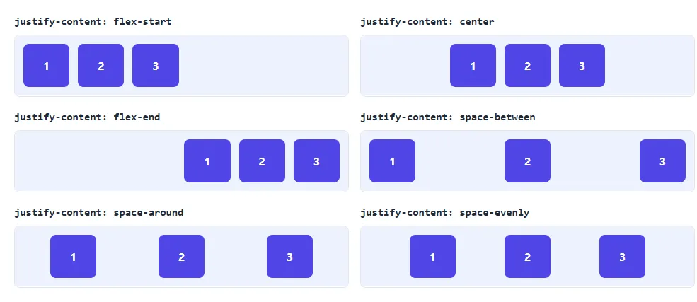
This property decides what happens with the free space in the row:
flex-start(default): items packed at the start.center: items grouped in the middle.flex-end: items packed at the end.space-between: first and last items touch the edges, equal space between the rest. Perfect for navbars.space-around: equal space around each item, so the edges get half-size gaps.space-evenly: exactly equal gaps everywhere, including the edges.
5. align-items: alignment on the cross axis
.container {
  display: flex;
  height: 200px;
  align-items: center;
  /* stretch (default) | flex-start | flex-end | center | baseline */
}
The default, stretch, makes items as tall as the container (if they have no fixed height). center centers them vertically in a row, which is why justify-content: center plus align-items: center is the go-to way to center a div. baseline lines up the text baselines, which is useful when items have different font sizes.
Note that the container needs extra height for vertical alignment to be visible. If the container is exactly as tall as its items, there is nothing to align.
6. flex-wrap and gap: responsive rows
By default, flex items stay on one line and shrink to fit, even if that squeezes them. Allow them to wrap onto new lines instead:
.container {
  display: flex;
  flex-wrap: wrap;
  gap: 16px;
}

.item {
  flex: 1 1 200px; /* grow, shrink, start at 200px */
}
Each item starts at 200px, grows to fill extra space, and moves to the next line when there is not enough room. This gives you a responsive grid of cards without any media queries. gap controls the space between both rows and columns.
7. flex-grow, flex-shrink and flex-basis
These three properties go on the items and control their size:
flex-grow: how much an item grows to fill extra space (0 means it does not grow).flex-shrink: how much it shrinks when space is tight (0 means it never shrinks).flex-basis: its starting size before growing or shrinking, like a flexible width.
In practice you will almost always use the flex shorthand, written in the order grow shrink basis:
.sidebar {
  flex: 0 0 240px; /* fixed 240px, never grows or shrinks */
}

.main {
  flex: 1;         /* takes all the remaining space */
}
This is the classic sidebar layout: the sidebar keeps a fixed 240px width, and the main area takes everything that is left. flex: 1 is short for flex: 1 1 0%, so if several items have flex: 1 they share the space equally.
8. align-self and order
.item:last-child {
  align-self: flex-end; /* only this item moves */
}

.item:first-child {
  order: 3;             /* visually move it to the end */
}
align-self overrides align-items for a single item. order changes the visual position of an item without touching the HTML. Use order sparingly: screen readers and keyboard navigation still follow the HTML order, so the visual and logical order can get confusing.
Paste the basic example into the editor and try every justify-content and align-items value.
Open the Code Editor →9. Real example: navbar and wrapping cards
Let’s combine everything into a small page: a navbar with the logo on the left and links on the right, and a row of cards that wraps on small screens.
<nav class="navbar">
  <a href="#" class="logo">MySite</a>
  <ul class="nav-links">
    <li><a href="#">Home</a></li>
    <li><a href="#">About</a></li>
    <li><a href="#">Contact</a></li>
  </ul>
</nav>

<section class="cards">
  <div class="card">
    <h2>Fast</h2>
    <p>Cards share the row equally and wrap on small screens.</p>
  </div>
  <div class="card">
    <h2>Flexible</h2>
    <p>Resize the preview to watch them move to a new line.</p>
  </div>
  <div class="card">
    <h2>Simple</h2>
    <p>No media queries needed, just flex-wrap and flex-basis.</p>
  </div>
</section>* {
box-sizing: border-box;
margin: 0;
padding: 0;
}
body {
font-family: system-ui, sans-serif;
background: #f5f7fb;
}
.navbar {
display: flex;
justify-content: space-between;
align-items: center;
padding: 16px 24px;
background: #1f2937;
}
.logo {
color: #fff;
font-weight: 700;
font-size: 1.2rem;
text-decoration: none;
}
.nav-links {
display: flex;
gap: 20px;
list-style: none;
}
.nav-links a {
color: #d1d5db;
text-decoration: none;
}
.cards {
display: flex;
flex-wrap: wrap;
gap: 20px;
padding: 24px;
}
.card {
flex: 1 1 220px;
background: #fff;
padding: 20px;
border-radius: 12px;
box-shadow: 0 2px 8px rgba(0, 0, 0, 0.08);
}
.card h2 {
font-size: 1.1rem;
margin-bottom: 8px;
color: #111827;
}
.card p {
color: #6b7280;
line-height: 1.5;
}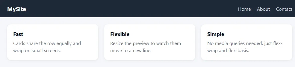
Here is what Flexbox does in this layout:
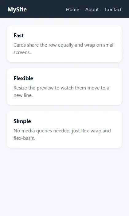
.navbarusesjustify-content: space-betweento push the logo and links to opposite sides, andalign-items: centerto line them up vertically..nav-linksis also a flex container. Nesting flex containers is normal and very common..cardsusesflex-wrap: wrapand each card hasflex: 1 1 220px, so the cards sit three in a row on wide screens and stack on phones.
Bonus: a footer that stays at the bottom
On pages with little content, the footer often floats up into the middle of the screen. Flexbox fixes it in a few lines, assuming your page has a <main> element between the header and footer:
body {
  min-height: 100vh;
  display: flex;
  flex-direction: column;
}

main {
  flex: 1; /* pushes the footer to the bottom */
}
Flexbox vs CSS Grid
| Flexbox | CSS Grid | |
|---|---|---|
| Dimensions | One at a time (row or column) | Two at once (rows and columns) |
| Sizing | Content decides the size | The grid decides the size |
| Best for | Navbars, buttons, toolbars, card rows, centering | Page layouts, galleries, dashboards |
They are not competitors. Most websites use Grid for the overall page structure and Flexbox for the components inside it.
Common Flexbox mistakes
- Putting
display: flexon the child instead of the parent. Flex properties likejustify-contentbelong on the container. - Expecting
align-itemsto work without height. The container must be taller than its items. - Mixing up the axes after
flex-direction: column. The two alignment properties swap directions. - Items not wrapping. Add
flex-wrap: wrapand give items aflex-basis, otherwise they just shrink. - Text overflowing a flex item. Flex items have
min-width: autoby default, so long words or URLs can overflow. Addmin-width: 0to the item.
Flexbox cheat sheet
On the container: display: flex, flex-direction, justify-content, align-items, flex-wrap, gap.
On the items: flex (grow, shrink, basis), align-self, order.
That is all you need for the vast majority of layouts. Practice by rebuilding real components you see online, such as a navbar, a pricing row or a footer, in the free code editor. When you are ready, use these skills to build your own portfolio website.
Frequently asked questions
What is Flexbox in CSS?
Flexbox (the Flexible Box Layout) is a CSS layout system for arranging items in a single row or column. You turn it on with display: flex on a parent element, then control spacing and alignment of the children with properties like justify-content and align-items.
What is the difference between justify-content and align-items?
justify-content aligns items along the main axis (horizontally in a row by default). align-items aligns them along the cross axis (vertically in a row). If you change flex-direction to column, the two swap directions.
When should I use Flexbox instead of CSS Grid?
Use Flexbox for one-dimensional layouts: a row of buttons, a navbar, or items that should wrap naturally. Use Grid when you need rows and columns to line up at the same time, like a full page layout or an image gallery.
Why is flex-wrap not working?
Items only wrap when they cannot fit, so check that they have a width or flex-basis. If every item has flex-shrink: 1 (the default) and no minimum size, they will shrink instead of wrapping. Give them a flex-basis such as flex: 1 1 220px.
Does Flexbox work in all browsers?
Yes. Flexbox, including the gap property, is supported in all current versions of Chrome, Edge, Firefox and Safari on desktop and mobile.