How to Center a Div in CSS: 6 Ways (With Live Examples)
Six reliable ways to center a div horizontally, vertically, or both, with copy-paste code, a comparison table, and the mistakes that stop centering from working.
Make the parent a flex container and center on both axes:
.container {
  display: flex;
  justify-content: center; /* horizontal */
  align-items: center;     /* vertical */
}
The parent needs a height (for example height: 100vh) for vertical centering to be visible. Below are five more methods and when each one is the right choice.
Centering a div is one of the first things every web developer needs, and one of the most searched CSS questions of all time. The good news: modern CSS makes it easy. The confusing part is that there are several ways to do it, and each one fits a slightly different situation.
In this guide you will learn six reliable methods, see exactly what each one does, and find out why centering sometimes “doesn’t work”. Every example uses the same small HTML snippet, so you can paste it into the free HixCode online code editor and switch between methods to watch the result change live.
The HTML and base CSS for every example
We have a .container (the parent) and a .box (the child we want to center). The dashed border lets you see the container’s edges.
<div class="container">
  <div class="box">Centered!</div>
</div>.container {
height: 300px;
border: 2px dashed #6c63ff;
}
.box {
width: 150px;
padding: 20px;
background: #6c63ff;
color: #fff;
text-align: center;
border-radius: 8px;
}Without any centering, the box sits in the top-left corner of the container. Now let’s move it to the middle.
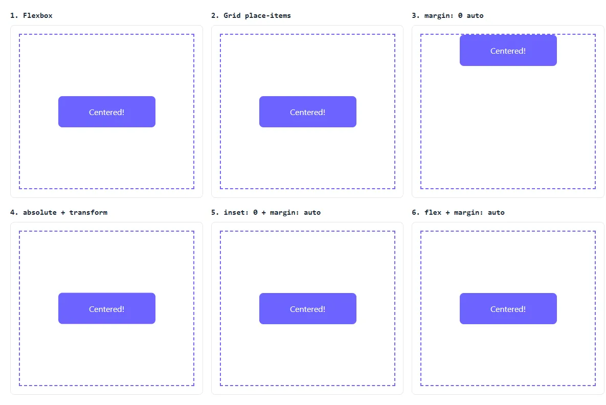
1. Flexbox: the best choice for most cases
Add three lines to the parent:
.container {
  display: flex;
  justify-content: center; /* horizontal */
  align-items: center;     /* vertical */
}
display: flex turns the container into a flex container. justify-content: center centers the child along the main axis (left to right), and align-items: center centers it along the cross axis (top to bottom).
Use it when: you want to center one item or a group of items. It is also the method you will use most in real layouts, so it is worth learning well. Our beginner’s Flexbox tutorial explains every property in detail.
2. CSS Grid with place-items
.container {
  display: grid;
  place-items: center;
}
place-items: center is a shorthand for align-items: center and justify-items: center. With Grid, centering a single element takes just two lines, the shortest method on this list.
Use it when: you are centering a single element, or the container is already a grid.
3. margin: 0 auto (horizontal only)
.box {
  margin: 0 auto; /* needs a width on .box */
}
This is the classic method. When a block element has a width, margin: 0 auto tells the browser to split the leftover horizontal space equally between the left and right margins, which puts the element in the middle.
It does not center vertically: auto margins on the top and bottom of a normal block element are treated as zero. That is why the box in the screenshot above stays at the top.
Use it when: centering a page wrapper, for example max-width: 1200px; margin: 0 auto; on a main content column.
4. Absolute position + transform
.container {
  position: relative;
}

.box {
  position: absolute;
  top: 50%;
  left: 50%;
  transform: translate(-50%, -50%);
}
top: 50% and left: 50% move the box’s top-left corner to the middle of the container. Then transform: translate(-50%, -50%) shifts the box back by half of its own width and height, so its center lands exactly in the middle.
The parent needs position: relative, otherwise the box positions itself against the nearest positioned ancestor, often the whole page.
Use it when: you need to place something on top of other content, like a badge over an image or a loading spinner over a card. It works even when you don’t know the box’s size.
5. inset: 0 + margin: auto
.container {
  position: relative;
}

.box {
  position: absolute;
  inset: 0;          /* top, right, bottom, left = 0 */
  margin: auto;
  height: fit-content; /* or a fixed height */
}
Setting inset: 0 stretches the box’s position to all four edges of the container. With margin: auto, the browser shares the free space equally on every side. The box must have a width and a height that are smaller than the container (here the width comes from the base CSS and fit-content sizes the height to the text), otherwise it would simply stretch to fill it.
Use it when: you are building modals or overlays with a known size and prefer not to use transforms.
6. Flex parent + margin: auto on the child
.container {
  display: flex;
}

.box {
  margin: auto;
}
Inside a flex container, auto margins absorb all available space in both directions. That means margin: auto on the child centers it horizontally and vertically, without justify-content or align-items.
Use it when: you want one specific child centered (or pushed to one side) while its siblings follow normal flex rules. For example, margin-left: auto on the last item in a navbar pushes it to the far right.
Paste the HTML and base CSS into the editor, then add one method at a time to compare them live.
Open the Code Editor →Which method should you use?
| Method | Horizontal | Vertical | Needs a fixed size? | Best for |
|---|---|---|---|---|
| Flexbox | Yes | Yes | No | Most layouts, groups of items |
| Grid place-items | Yes | Yes | No | A single item, shortest code |
| margin: 0 auto | Yes | No | Width only | Page wrappers and columns |
| absolute + transform | Yes | Yes | No | Overlays, badges, spinners |
| inset: 0 + margin: auto | Yes | Yes | Width and height | Modals with a known size |
| flex + margin: auto | Yes | Yes | No | Centering one child among others |
If you are unsure, use Flexbox. It handles almost every case and you will reuse the same knowledge for navbars, cards and forms. Our login page tutorial, for example, centers the whole form on the screen with exactly these three lines.
Bonus: centering text inside a div
Text, links and images are inline content, so they follow different rules from block elements. To center them horizontally inside their container, use:
.box {
  text-align: center;
}
To center a single line of text vertically too, combine it with Flexbox on the same element: display: flex; align-items: center; justify-content: center;.
Why isn’t my div centering? 5 common mistakes
- The parent has no height. A container is only as tall as its content by default, so there is no extra space to center in vertically. Give the parent a
heightormin-height, such asmin-height: 100vhfor a full screen. - The styles are on the wrong element.
justify-contentandalign-itemsgo on the parent, not on the element you want to move. - margin: auto without a width. A block element is full width by default, so there is no leftover space to split. Set a
widthormax-width. - Forgetting position: relative. With absolute positioning, the child is placed relative to the nearest positioned ancestor. Without
position: relativeon the parent, it may center on the whole page instead. - Overwriting the transform. If you add another
transformlater (for example a hover scale), it replacestranslate(-50%, -50%). Combine them in one rule:transform: translate(-50%, -50%) scale(1.05);
Browser support
All six methods work in every current version of Chrome, Edge, Firefox and Safari, on desktop and mobile. You no longer need old tricks like display: table-cell or negative margins.
Summary
- For most cases, use Flexbox on the parent:
display: flex; justify-content: center; align-items: center; - For the shortest code, use Grid:
display: grid; place-items: center; - For horizontal centering of a wrapper, use
margin: 0 autowith a width. - For overlays, use absolute positioning with
transform: translate(-50%, -50%). - If vertical centering fails, check that the parent has a height.
The fastest way to really understand these methods is to try them yourself. Copy the snippets above into the HixCode code editor, change the container size, and watch how each method reacts.
Frequently asked questions
What is the easiest way to center a div in CSS?
Put display: flex; justify-content: center; align-items: center; on the parent element and give the parent a height. The child div is then centered both horizontally and vertically.
How do I center a div horizontally only?
Give the div a width (or max-width) and set margin: 0 auto;. The browser splits the remaining space equally on the left and right. This works for block elements and does not center vertically.
Why is my div not centering vertically?
Usually the parent has no height. A parent that is only as tall as its content leaves no extra space to center in. Give the parent a height such as 100vh or 300px, or min-height, and apply the centering styles to the parent, not the child.
Should I use Flexbox or Grid to center a div?
Both work in every modern browser. Grid with place-items: center is the shortest code for a single item. Flexbox is the better choice when you are also lining up several items in a row or column.
How do I center text inside a div?
Use text-align: center; on the div to center inline content such as text, links and images horizontally. To center the text vertically as well, make the div a flex container with align-items: center.