How to Make a Portfolio Website with HTML & CSS (Free Template)
A complete, responsive one-page portfolio template, how to make it yours, and two free ways to put it online today.
A portfolio website needs five sections: a header, a hero with your name and role, an about section with your skills, your projects, and a contact section. Copy the free template below into an online editor, replace the placeholder text with your own details, download it as index.html, and publish it for free on GitHub Pages or Netlify.
A personal portfolio is the single most useful project for a new developer. It shows employers and clients what you can do, gives you a link to put on your CV and LinkedIn, and is a great way to practice HTML and CSS on something you actually care about.
In this guide you will get a complete, responsive one-page portfolio template, learn how each part works, customize it without installing anything, and put it online for free. The whole template is plain HTML and CSS with a single line of JavaScript, so it loads fast and is easy to understand.
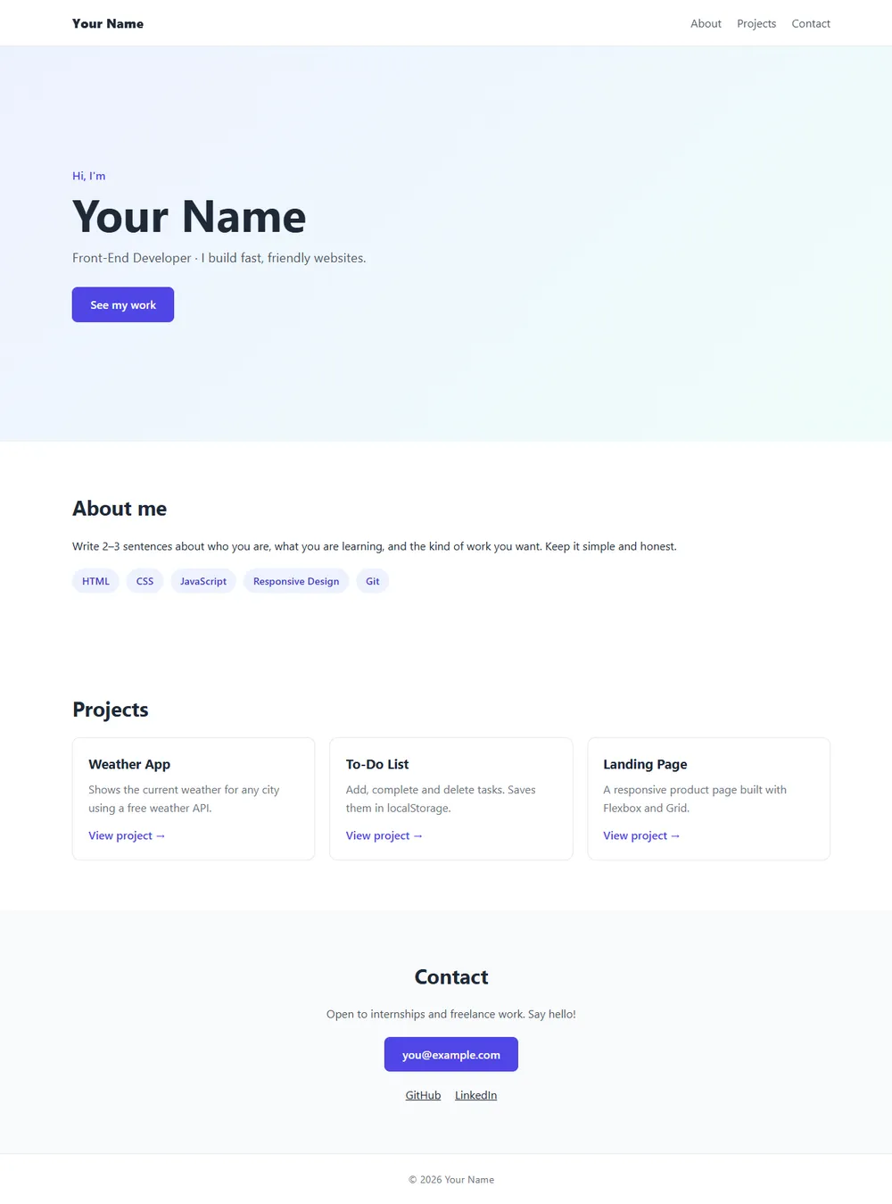
What to include in your portfolio
- Header: your name or logo, and links to the sections of the page.
- Hero: who you are and what you do, in one sentence, plus a button to your work.
- About: two or three honest sentences and a list of your skills.
- Projects: 3 to 6 projects, each with a short description and a link to a live demo or the code.
- Contact: an email link and your GitHub and LinkedIn profiles.
That is it. A focused page with real projects beats a long page full of animations. Recruiters often spend less than a minute on a portfolio, so make the important things easy to find.
Step 1: The HTML
Open the HixCode online code editor and paste this into the HTML tab. It uses semantic elements (<header>, <section>, <article>, <footer>), which helps screen readers and search engines understand your page.
<header class="site-header">
  <a href="#" class="logo">Your Name</a>
  <nav>
    <a href="#about">About</a>
    <a href="#projects">Projects</a>
    <a href="#contact">Contact</a>
  </nav>
</header>

<section class="hero">
  <p class="hello">Hi, I'm</p>
  <h1>Your Name</h1>
  <p class="role">Front-End Developer · I build fast, friendly websites.</p>
  <a href="#projects" class="btn">See my work</a>
</section>

<section id="about" class="section">
  <h2>About me</h2>
  <p>Write 2–3 sentences about who you are, what you are learning,
     and the kind of work you want. Keep it simple and honest.</p>
  <div class="skills">
    <span>HTML</span>
    <span>CSS</span>
    <span>JavaScript</span>
    <span>Responsive Design</span>
    <span>Git</span>
  </div>
</section>

<section id="projects" class="section">
  <h2>Projects</h2>
  <div class="projects">
    <article class="project">
      <h3>Weather App</h3>
      <p>Shows the current weather for any city using a free weather API.</p>
      <a href="#">View project →</a>
    </article>
    <article class="project">
      <h3>To-Do List</h3>
      <p>Add, complete and delete tasks. Saves them in localStorage.</p>
      <a href="#">View project →</a>
    </article>
    <article class="project">
      <h3>Landing Page</h3>
      <p>A responsive product page built with Flexbox and Grid.</p>
      <a href="#">View project →</a>
    </article>
  </div>
</section>

<section id="contact" class="section contact">
  <h2>Contact</h2>
  <p>Open to internships and freelance work. Say hello!</p>
  <a href="mailto:you@example.com" class="btn">you@example.com</a>
  <div class="socials">
    <a href="https://github.com/" target="_blank" rel="noopener">GitHub</a>
    <a href="https://www.linkedin.com/" target="_blank" rel="noopener">LinkedIn</a>
  </div>
</section>

<footer class="site-footer">
  © <span id="year"></span> Your Name
</footer>
The navigation links point to section ids like #projects, so clicking them jumps to that part of the page. Each project is an <article>, because each one is a self-contained piece of content.
Step 2: The CSS
Paste this into the CSS tab:
* {
  box-sizing: border-box;
  margin: 0;
  padding: 0;
}

html {
  scroll-behavior: smooth;
}

body {
  font-family: system-ui, -apple-system, "Segoe UI", Roboto, sans-serif;
  color: #1f2937;
  line-height: 1.6;
}

a {
  color: inherit;
}

.site-header {
  position: sticky;
  top: 0;
  display: flex;
  justify-content: space-between;
  align-items: center;
  padding: 18px 8%;
  background: rgba(255, 255, 255, 0.95);
  border-bottom: 1px solid #e5e7eb;
}

.logo {
  font-size: 1.15rem;
  font-weight: 800;
  text-decoration: none;
}

.site-header nav {
  display: flex;
  gap: 22px;
}

.site-header nav a {
  color: #4b5563;
  text-decoration: none;
}

.site-header nav a:hover {
  color: #4f46e5;
}

.hero {
  min-height: 70vh;
  display: flex;
  flex-direction: column;
  justify-content: center;
  align-items: flex-start;
  padding: 60px 8%;
  background: linear-gradient(135deg, #eef2ff, #f0fdfa);
}

.hello {
  color: #4f46e5;
  font-weight: 600;
}

.hero h1 {
  font-size: clamp(2.4rem, 6vw, 4rem);
  line-height: 1.1;
  margin: 6px 0 12px;
}

.role {
  font-size: 1.15rem;
  color: #4b5563;
  margin-bottom: 28px;
}

.btn {
  display: inline-block;
  padding: 12px 26px;
  background: #4f46e5;
  color: #fff;
  border-radius: 8px;
  font-weight: 600;
  text-decoration: none;
}

.btn:hover {
  background: #4338ca;
}

.section {
  padding: 70px 8%;
}

.section h2 {
  font-size: 1.8rem;
  margin-bottom: 18px;
}

.skills {
  display: flex;
  flex-wrap: wrap;
  gap: 10px;
  margin-top: 20px;
}

.skills span {
  padding: 6px 14px;
  background: #eef2ff;
  color: #4338ca;
  border-radius: 999px;
  font-size: 0.9rem;
  font-weight: 600;
}

.projects {
  display: grid;
  grid-template-columns: repeat(auto-fit, minmax(240px, 1fr));
  gap: 20px;
}

.project {
  padding: 22px;
  border: 1px solid #e5e7eb;
  border-radius: 12px;
  transition: transform 0.2s, box-shadow 0.2s;
}

.project:hover {
  transform: translateY(-4px);
  box-shadow: 0 10px 25px rgba(0, 0, 0, 0.08);
}

.project h3 {
  margin-bottom: 8px;
}

.project p {
  color: #6b7280;
  margin-bottom: 14px;
}

.project a {
  color: #4f46e5;
  font-weight: 600;
  text-decoration: none;
}

.contact {
  text-align: center;
  background: #f9fafb;
}

.contact p {
  margin-bottom: 20px;
  color: #4b5563;
}

.socials {
  display: flex;
  justify-content: center;
  gap: 20px;
  margin-top: 20px;
}

.site-footer {
  padding: 24px;
  text-align: center;
  color: #6b7280;
  font-size: 0.9rem;
  border-top: 1px solid #e5e7eb;
}

@media (max-width: 600px) {
  .site-header {
    flex-direction: column;
    gap: 10px;
  }

  .hero {
    min-height: auto;
    padding: 50px 6%;
  }

  .section {
    padding: 50px 6%;
  }
}
How the layout works
- Sticky header:
position: sticky; top: 0;keeps the navigation visible while scrolling.html { scroll-behavior: smooth; }makes the jump links scroll smoothly. - Hero: a column flex container with
justify-content: centerplaces the text in the vertical middle of the section. The heading usesclamp(2.4rem, 6vw, 4rem), so it scales with the screen but never gets too small or too large. - Skills: a flex row with
flex-wrap: wrapandgap, so the tags flow onto new lines on small screens. Our Flexbox tutorial covers these properties in depth. - Projects: CSS Grid with
repeat(auto-fit, minmax(240px, 1fr))creates as many columns as fit, each at least 240px wide. Three columns on desktop, one on phones, with no media query. - Spacing in percentages:
padding: 70px 8%keeps comfortable side margins that shrink on smaller screens. - Mobile tweaks: the media query stacks the header and reduces padding below 600px.
Step 3: One line of JavaScript
Paste this into the JS tab to keep the copyright year in the footer up to date automatically:
document.getElementById("year").textContent = new Date().getFullYear();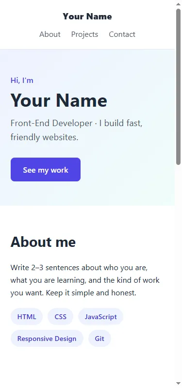
Paste the template into the editor and replace “Your Name” with yours. You will see it update as you type.
Open the Code Editor →Step 4: Make it yours
- Replace every “Your Name” in the header, hero and footer.
- Write your role in one short line, for example “Junior Web Developer” or “Computer Science student who loves building websites”.
- Update the skills to match what you actually know. Honesty matters more than a long list.
- Add your real projects. No projects yet? Start with small ones: a login page, a landing page, a calculator or a to-do list. Link each one to a live demo.
- Change the email in the
mailto:link and the button text, and add your real GitHub and LinkedIn URLs. - Pick your color. The accent color
#4f46e5appears 4 times in the CSS, and a darker shade#4338caappears twice. Change them all to your favorite color.
Optional extras: add a profile photo with an <img> in the hero, a “Download CV” button linking to a PDF, or a short testimonial from a teacher or client.
Step 5: Save your website as a file
When you are happy with it, click Download in the editor. You will get a single HTML file that contains your HTML, CSS and JavaScript together. Rename it to index.html. This is the standard name for a website’s home page, and hosting services look for it automatically.
Double-click the file to open it in your browser and check that everything looks right.
Step 6: Publish it online for free
Option A: GitHub Pages
- Create a free account on GitHub if you don’t have one.
- Create a new public repository named exactly
yourusername.github.io(using your own GitHub username). - Click Add file → Upload files, upload your
index.html, and commit. - After a minute or two, your site is live at
https://yourusername.github.io. You can check the status under Settings → Pages.
GitHub Pages is a great choice for developers, because your portfolio and your code live in the same place, and recruiters can see both.
Option B: Netlify Drop
- Put
index.htmlin a folder on your computer. - Open Netlify Drop and drag the folder onto the page.
- Netlify gives you a free web address straight away. Create a free account when asked so the site stays online, then rename the address in the site settings.
Both options include free HTTPS, and both let you connect a custom domain later if you buy one.
Tips for a portfolio that gets noticed
- Quality over quantity. Three finished, working projects beat ten half-finished ones.
- Explain your role. For each project, say in one line what problem it solves and what you built.
- Check it on your phone. Many people will open your link on mobile first.
- Keep it fast. Compress images, and avoid heavy libraries you don’t need.
- Proofread. Spelling mistakes are the easiest thing to fix and the most noticeable.
- Update it. Add every new project you finish. Your portfolio grows with you.
Summary
You now have a complete portfolio website made with only HTML and CSS: a sticky header, a hero, an about section with skills, a responsive project grid and a contact section. You customized it in your browser, saved it as index.html, and published it for free. Share the link on your CV, LinkedIn and GitHub profile, and keep adding projects as you learn.
Frequently asked questions
Can I make a portfolio website with only HTML and CSS?
Yes. A portfolio is mostly content and layout, which is exactly what HTML and CSS do. The template in this guide uses one line of JavaScript for the footer year, and works fine without it.
How do I publish my portfolio website for free?
Two easy options are GitHub Pages and Netlify. With GitHub Pages you upload index.html to a repository named yourusername.github.io. With Netlify Drop you drag the folder containing index.html onto the upload page. Both give you a free HTTPS address.
What should I put in a beginner portfolio?
A short introduction, 3 to 6 projects with a one-line description and a link, a list of your skills, and a clear way to contact you. Real projects you built, even small ones, matter more than design.
Do I need a custom domain for my portfolio?
No. A free address like yourname.github.io is fine to start. You can connect a custom domain later; both GitHub Pages and Netlify support it.
How do I make my portfolio mobile-friendly?
Include the viewport meta tag, use flexible layouts (Flexbox and Grid), avoid fixed pixel widths, and add a media query for small screens. The template in this guide already does all of these.