Responsive Navbar with HTML, CSS & JavaScript (Hamburger Menu)
A navigation bar that shows links in a row on desktop and a hamburger menu on phones, with keyboard and screen reader support built in.
A responsive navbar is a <nav> with a logo and a list of links laid out with Flexbox. Below 768px a media query hides the links and shows a hamburger button, and a few lines of JavaScript toggle an open class to show the menu. The complete, tested HTML, CSS and JavaScript is below.
Almost every website needs a navigation bar, and it has to work on a wide monitor and on a phone that is only 360 pixels across. On a desktop there is room for every link in one row. On a phone there is not, so the links move into a menu that opens when you tap a button with three lines: the “hamburger” menu.
In this tutorial you will build that navbar from scratch. It is short, it has no dependencies, and it handles the details that many examples skip: keyboard users, screen readers, and what happens when the window is resized. Paste each block into the matching tab of the HixCode online code editor and drag the preview narrower to watch it change.
Step 1: The HTML
Copy this into the HTML tab:
<header class="site-header">
  <nav class="navbar" aria-label="Main">
    <a href="#" class="logo">MySite</a>

    <button class="menu-toggle" id="menuToggle"
            aria-label="Open menu" aria-expanded="false" aria-controls="navLinks">
      <span class="bar"></span>
      <span class="bar"></span>
      <span class="bar"></span>
    </button>

    <ul class="nav-links" id="navLinks">
      <li><a href="#home">Home</a></li>
      <li><a href="#about">About</a></li>
      <li><a href="#services">Services</a></li>
      <li><a href="#contact" class="nav-cta">Contact</a></li>
    </ul>
  </nav>
</header>

<main class="content">
  <h1>Responsive navbar</h1>
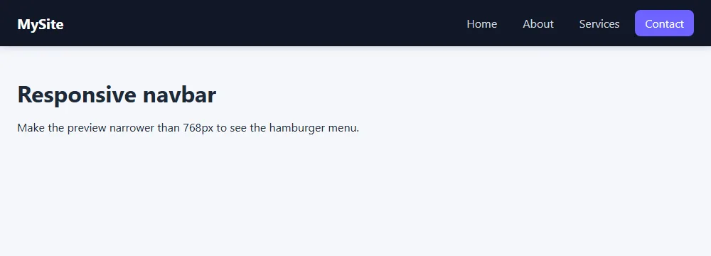
  <p>Make the preview narrower than 768px to see the hamburger menu.</p>
</main>
What each part does
<nav aria-label="Main">:navtells browsers and screen readers that this is navigation. The label helps when a page has more than onenav, such as a second one in the footer.- A real
<button>for the hamburger: buttons can be focused with the Tab key and pressed with Enter or Space without any extra code. A clickable<div>cannot. aria-expanded: tells screen readers whether the menu is open. We will switch it betweenfalseandtruewith JavaScript.aria-controls: links the button to the element it opens, using the list’sid.- A
<ul>of links: a list lets assistive technology announce “list, 4 items”, so people know how many links to expect.
Step 2: The CSS
Paste this into the CSS tab:
* {
  box-sizing: border-box;
  margin: 0;
  padding: 0;
}

body {
  font-family: system-ui, -apple-system, "Segoe UI", Roboto, sans-serif;
  background: #f5f7fb;
  color: #1f2937;
}

.site-header {
  position: sticky;
  top: 0;
  background: #111827;
  box-shadow: 0 2px 10px rgba(0, 0, 0, 0.15);
}

.navbar {
  position: relative;
  display: flex;
  justify-content: space-between;
  align-items: center;
  max-width: 1100px;
  margin: 0 auto;
  padding: 14px 24px;
}

.logo {
  color: #fff;
  font-size: 1.25rem;
  font-weight: 700;
  text-decoration: none;
}

.nav-links {
  display: flex;
  align-items: center;
  gap: 8px;
  list-style: none;
}

.nav-links a {
  display: block;
  padding: 8px 14px;
  color: #d1d5db;
  text-decoration: none;
  border-radius: 8px;
  transition: background 0.2s, color 0.2s;
}

.nav-links a:hover,
.nav-links a:focus-visible {
  background: #1f2937;
  color: #fff;
}

.nav-links .nav-cta {
  background: #6c63ff;
  color: #fff;
}

.nav-links .nav-cta:hover,
.nav-links .nav-cta:focus-visible {
  background: #574fd6;
}

/* Hamburger button: hidden on wide screens */
.menu-toggle {
  display: none;
  flex-direction: column;
  justify-content: center;
  gap: 5px;
  width: 44px;
  height: 44px;
  padding: 10px;
  background: none;
  border: 0;
  border-radius: 8px;
  cursor: pointer;
}

.menu-toggle .bar {
  display: block;
  height: 2px;
  background: #fff;
  border-radius: 2px;
  transition: transform 0.25s, opacity 0.25s;
}

/* Turn the three bars into an X when the menu is open */
.menu-toggle[aria-expanded="true"] .bar:nth-child(1) {
  transform: translateY(7px) rotate(45deg);
}

.menu-toggle[aria-expanded="true"] .bar:nth-child(2) {
  opacity: 0;
}

.menu-toggle[aria-expanded="true"] .bar:nth-child(3) {
  transform: translateY(-7px) rotate(-45deg);
}

.content {
  max-width: 1100px;
  margin: 0 auto;
  padding: 40px 24px;
  line-height: 1.6;
}

.content h1 {
  margin-bottom: 10px;
}

/* Small screens: show the button, turn the links into a dropdown */
@media (max-width: 768px) {
  .menu-toggle {
    display: flex;
  }

  .nav-links {
    display: none;
    position: absolute;
    top: 100%;
    left: 0;
    right: 0;
    flex-direction: column;
    align-items: stretch;
    gap: 4px;
    padding: 12px 24px 20px;
    background: #111827;
    box-shadow: 0 12px 20px rgba(0, 0, 0, 0.2);
  }

  .nav-links.open {
    display: flex;
  }

  .nav-links a {
    padding: 12px 14px;
  }

  .nav-links .nav-cta {
    text-align: center;
    margin-top: 6px;
  }
}
The desktop layout
.navbar is a flex container. justify-content: space-between pushes the logo to the left edge and the links to the right, and align-items: center lines them up vertically. The link list is a second flex container, with gap for the space between links. If these properties are new to you, our Flexbox tutorial for beginners explains each one.
position: sticky; top: 0; on the header keeps the bar at the top of the screen while the page scrolls. Unlike position: fixed, a sticky header still takes up its own space, so it never covers the start of your content.
The mobile layout
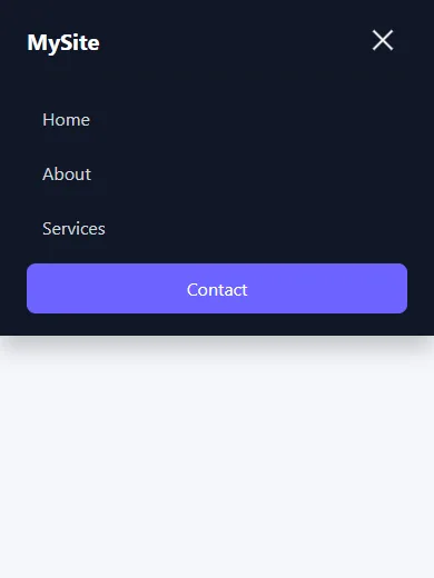
Everything inside @media (max-width: 768px) applies only to narrow screens:
- The hamburger button changes from
display: nonetodisplay: flex. - The links get
display: none, so they are hidden until the menu is opened. This also removes them from the Tab order, which is what we want for a closed menu. position: absolute; top: 100%; left: 0; right: 0;places the list directly under the bar and stretches it across the full width. This works because.navbarhasposition: relative.flex-direction: columnstacks the links, and.nav-links.openswitches the list back todisplay: flex.
Turning the three bars into an X
The selector .menu-toggle[aria-expanded="true"] styles the button only while the menu is open. The top and bottom bars move to the middle and rotate 45 degrees in opposite directions, and the middle bar fades out. Using the ARIA attribute as the styling hook means the look and the accessible state can never get out of sync.
Step 3: The JavaScript
Paste this into the JS tab:
const toggle = document.getElementById("menuToggle");
const navLinks = document.getElementById("navLinks");

function setMenu(open) {
  navLinks.classList.toggle("open", open);
  toggle.setAttribute("aria-expanded", String(open));
  toggle.setAttribute("aria-label", open ? "Close menu" : "Open menu");
}

// Open or close when the button is clicked
toggle.addEventListener("click", function () {
  const isOpen = toggle.getAttribute("aria-expanded") === "true";
  setMenu(!isOpen);
});

// Close after choosing a link
navLinks.addEventListener("click", function (event) {
  if (event.target.closest("a")) {
    setMenu(false);
  }
});

// Close with the Escape key and return focus to the button
document.addEventListener("keydown", function (event) {
  if (event.key === "Escape" && navLinks.classList.contains("open")) {
    setMenu(false);
    toggle.focus();
  }
});

// Reset when the window becomes wide again
window.matchMedia("(min-width: 769px)").addEventListener("change", function (event) {
  if (event.matches) {
    setMenu(false);
  }
});
The script is built around one small function, setMenu(open), which does three things:
- Adds or removes the
openclass.classList.toggle("open", open)with a second argument forces the class on or off instead of flipping it. - Updates
aria-expandedso screen readers announce “expanded” or “collapsed”. - Changes the button’s label between “Open menu” and “Close menu”.
Four event listeners then call it:
- Click on the button: reads the current state and switches to the opposite.
- Click on a link: closes the menu. Without this, on a one-page site the menu stays open and covers the section the visitor just jumped to.
- Escape key: closes the menu and moves focus back to the button, so keyboard users are not left on a hidden link.
- Window becomes wide:
matchMediafires when the screen crosses 769px, and we reset the state. Otherwise rotating a tablet could leave the button marked as open.
Paste the three blocks into the editor, then drag the preview narrower to see the hamburger appear.
Open the Code Editor →Highlighting the current page
Visitors should be able to see which page they are on. Add aria-current="page" to the link for the current page in your HTML, then style it:
.nav-links a[aria-current="page"] {
  color: #fff;
  font-weight: 600;
  box-shadow: inset 0 -2px 0 #6c63ff;
}
Like aria-expanded, this attribute does two jobs at once: screen readers announce “current page”, and your CSS uses it as the selector.
Ways to customize it
- Change the breakpoint. If you have more links, switch to the hamburger earlier, for example
max-width: 900px. Remember to change the number in the JavaScriptmatchMedialine to one pixel more. - Add a slide animation.
displaycannot be animated. To slide the menu, keep itdisplay: flexand animatemax-heightortransforminstead, withvisibility: hiddenwhile closed so the links stay out of the Tab order. Our CSS animation examples cover the basics. - Use a logo image. Replace the text with an
<img>and give it a fixedheightso the bar does not jump while the image loads. - Light theme. Change the two dark backgrounds (
#111827) to white, the link color to a dark gray, and the bars to a dark color.
Common mistakes to avoid
- Forgetting the viewport meta tag. Without
<meta name="viewport" content="width=device-width, initial-scale=1">in the page<head>, phones pretend to be 980px wide and your media query never runs. - Using a
<div>or an icon alone as the menu button, which keyboard users cannot reach. - Hiding the menu with
opacity: 0only. The links are invisible but can still be focused and clicked. - Making tap targets too small. Aim for at least 44 by 44 pixels, which is why the button has a fixed size and the mobile links have extra padding.
- Not testing by resizing. Open the menu on a narrow screen, widen the window, and check that nothing is stuck.
Summary
You built a navigation bar that uses Flexbox for the layout, one media query for small screens, and about thirty lines of JavaScript for the menu. It works with a mouse, touch and keyboard, and it tells screen readers what is happening.
A good next step is to drop it into a real page: the portfolio website tutorial has a simple header that you can replace with this one.
Frequently asked questions
How do I make a navbar responsive?
Lay out the logo and links with Flexbox, then add a media query such as @media (max-width: 768px) that hides the links and shows a menu button. A small script toggles a class on the link list to open and close it. Also make sure the page has the viewport meta tag, or the media query will not run on phones.
Can I make a hamburger menu without JavaScript?
Yes, with a hidden checkbox and the :checked selector, or with the details element. These work, but they cannot update aria-expanded, close the menu on Escape, or close it after a link is clicked, so a few lines of JavaScript give a more accessible result.
What is the best breakpoint for a mobile navbar?
768px is a common choice because it separates most phones from tablets and laptops, but the right breakpoint is the width at which your own links stop fitting in one row. If you have many links, switch to the hamburger menu earlier, for example at 900px.
How do I make the navbar stay at the top when scrolling?
Add position: sticky; top: 0; to the header. A sticky header keeps its place in the page layout, so it does not cover your content the way position: fixed can.
Why is my hamburger menu not working on mobile?
The most common causes are a missing viewport meta tag, a script that runs before the HTML has loaded so the button is not found, a class name in the JavaScript that does not match the CSS, or another element covering the button. Check the browser console for errors first.